Today it's time to try to understand the cities; its urbanism, its structure or how they are evolving over time. For it, we have selected a series of freely accessible online maps that combine databases (Big Data) and cartography, providing us with very useful information for our work and projects.
The accesses to the cartography tools that we provide are worldwide, except for the last section that is dedicated exclusively to the territory of Spain.
Content menu:
Yes, it is true that we can find different maps that They show us the relief and height of the terrain practically anywhere in the world, but in most cases, not allow you to work offline, we cannot download the information from a specific area.
In this case, we would go to Maps3d.io. A project that simple form allows us to select any region of the planet and get a perspective to appreciate the elevations and terrain relief.
The steps to follow are; search for the desired area (mountains, city, rural area, etc.), select the box with the mouse that we want to visualize in 3D and click on «Explore in 3D». See the generated map and get the animation link.
Sometimes the generated link gets "hooked" to download the image. The solution, right mouse button and "Save image like…”.
We have to comment that here, Google has implemented different updates both in Google Maps and in Google Earth, improving that lack that it had with reference to observe the buildings in three dimensions, but even so, the tool par excellence and that we already discussed in our article about interactive maps on cities in 3D, is the F4map.
With this free tool we will not only see the buildings in 3D, we can also use different filters so that the elements that we may need are included in our project.

As we can see in the image above, the section on "Ground elevations", the elevations on the ground, represents a new feature that provides improvements important in visualization regarding the typical satellite maps that provide information flat on the atlas of the world .

Tools for trying to understand how many people live in a certain area or a city, there are several. But what we can see it in a 3D graph on a map, there is much few.
In this case we are talking about a tool created by Matt Daniels, what can we check from here (Takes a while in loading the atlas). A map that helps us visualize what areas of the world are the least and most populated with visualization quite detailed.
As if that were not enough, it also allows you to compare periods of population density between the years 1990, 1975 and 2015, being able to check demographic changes in a city determined.
In the same vein, a map has recently been published interactive that analyzes human settlements at scale global. The Global Human Settlement Layer – GHSL is prepared by the CCI of the European Commission and the CIESIN University of Columbia. This dataset makes several strides toward a best cartography in the field of urban diversity overall.
From the fantastic interactive map below in lightpollutionmap, it will help us to better understand the light pollution associated – of course – with the distribution of humanity on our planet.
This is an application that displays overlays from VIIRS / DMSP / World Atlas and measurements over the layers Microsoft Bing database, with the aim of displaying data from VIIRS / DMSP in a friendlier way.

An excellent map to carry out studies of various kinds that in addition to being able to select certain areas or zoom where applicable, different filters are available.
One of the best data sets for understanding the explosive growth of cities around the world in the past 65 years, is the research provided by UN World Urbanization Prospects.
The map records the urban transformation of cities most important from 1950 to 2014, and includes the Projected populations up to 2030. It can be consulted from Luminocity3d.

Another atlas of interest, which we already discussed in the article on how to see the road expansion of your city. It is developed by Geoff Boeing. This online application visualizes the consistency of the road network of any city in the world.
This tool developed by the Organization of United Nations for Food and Agriculture (FAO) and the National Aeronautics and Space Administration of the United States (NASA), wants to help control and understand - to global level – land use and landscape changes in anywhere.
The Collect Earth Online (CEO) map is web-based, is free, available to anyone who wants to consult and not requires no downloads or installation, and allows you to browse detailed any location on Earth with data satellite.

Air pollution is one of the biggest problems of our time. For both developed countries and especially in developing countries.
Pollution levels vary drastically across function of the point of the planet in which we are. We know that big cities like Madrid, Barcelona, Paris or London have really serious problems with quality of your air.
To analyze this problem, different organizations have implemented interactive online atlases that track the daily air pollution around the planet.

One of the most impressive maps is the one that collects the most of 10,000 atmospheric stations spread throughout the world; from government sources, satellite images and sensors around the Earth. From AirVisual Earth, we can see the levels of contamination of almost all corners of the planet in real time.
As a note, and remembering the article on how to know the air pollution in real time. It also can consult the Waqi portal. Where can we track level worldwide, a large number of weather stations that provide data on air quality in time royal.

The theory is that each country has an administration, what deals with infrastructure and urbanism issues where we can find highly relevant information to be able to practice any kind of study from a fairly technique.
In the case of Spain, we have the Development department, where from the next page multiple maps converge on Geo-Information, we find data from; cartography, astronomy, geophysics or geodesy, and a relevant section on observation of the territory or services where we can see:
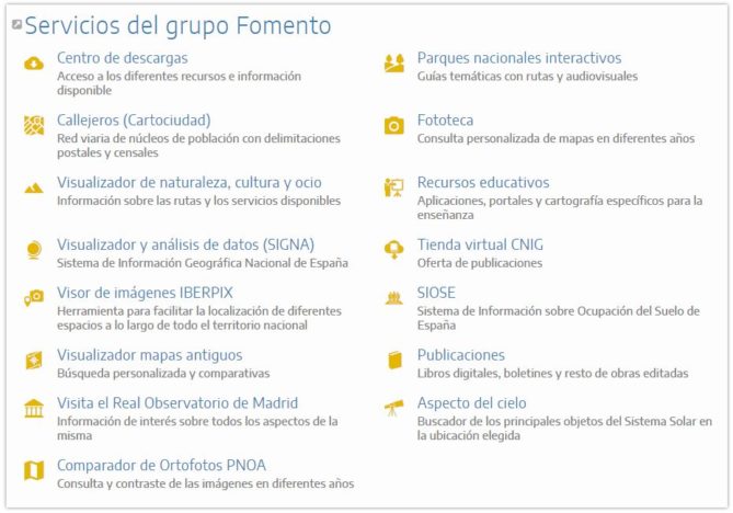
You can recognize a multitude of online applications on cartography of Spain in a fairly detailed way. as per For example, access to Signa (Geographic Information System Nacional) to consult the types of urban land of all the national territory:
As we have seen, on the Internet we have a lot of information and We hope that one of the previous cartographic charts online can help you in the elaboration of your projects.
If you liked the article, rate it and share!